Dec 2019
Mario's App

About project
Mario's Pizza is a local restaurant chain that aims to offer authentic Italian cuisine at competitive prices. Their target customers are anyone who enjoys healthy and delicious meals but lacks the time to prepare them themselves.
Competitive audit:
I conducted a competitive audit to identify what other pizza restaurants are doing in terms of online ordering and delivery. This helped me to understand what features are expected by users and where Mario's Pizza can differentiate itself from the competition.

Direct competitors
User research
To design an app that meets the needs of users, I conducted user research through interviews and empathy maps. I identified working adults as a primary user group who lack time for meal prep. However, research also revealed that time was not the only factor limiting users from cooking at home.
Pain points
Through user research, I identified several pain points:
Lack of assistive technologies
Difficulty-to-read text-heavy menus
Limited ordering options
I also identified two personas, Anastasia and Bogdan, who have different needs and motivations for using the app.

Two types of pesonas
User journey map
Mapping the user journey revealed how helpful it would be for users to have access to a dedicated Mario's Pizza app. This allowed for easy ordering and customization of meals without leaving home.

Customer journey map results
User flow and wireframes
I created paper wireframes to ensure that the elements that made it to digital wireframes would be well-suited to address user pain points.
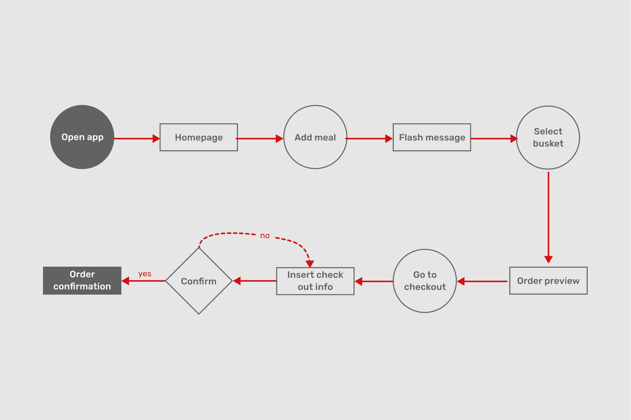
Main user flow
Easy navigation and assistive technology compatibility were key user needs addressed in the design.
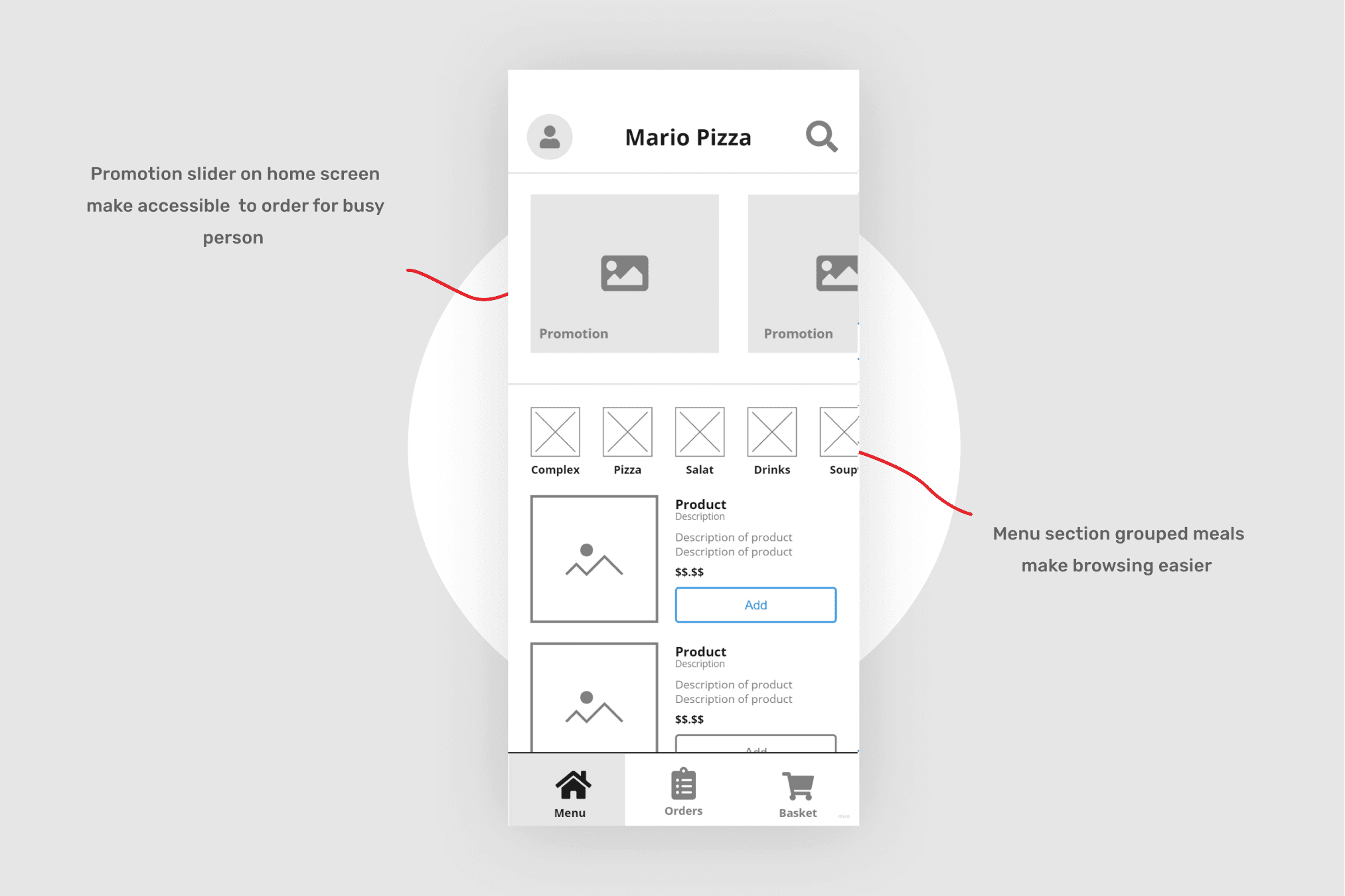
Design desigions at the homescreen. No 2
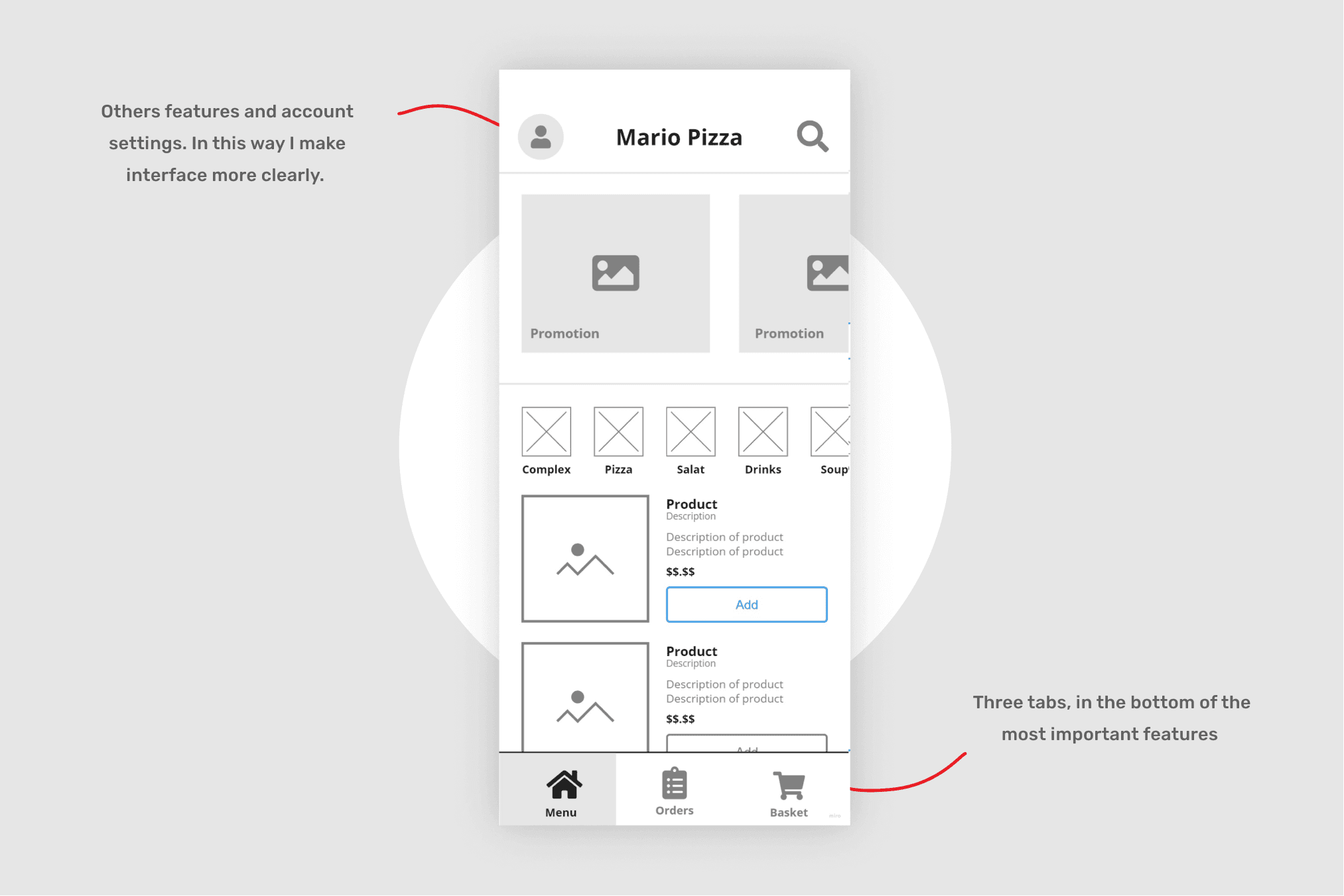
Design desigions at the homescreen. No 2
Low-fidelity prototype
I created a low-fidelity prototype to test the primary user flow of building and ordering a pizza, which allowed me to uncover user preferences and issues with the app's interface.

Screenshot of a lo-fi prototype from Figma
Usability study
I conducted a usability study with users to test the low-fidelity prototype, which revealed several areas for improvement, including the need for more customization options, delivery tracking, and a simpler checkout process.

Checkout refining after usability study

Orders refining after usability study
Interesting fact
According to a study by Morgan Stanley, food delivery sales in the United States are projected to reach $220 billion by 2023. In addition, the COVID-19 pandemic has accelerated the adoption of food delivery services, as more people order meals for delivery or pickup instead of dining in restaurants.
This has led to the emergence of "ghost kitchens," which are commercial kitchens that are used exclusively for food delivery orders and don't have any physical restaurant storefronts.
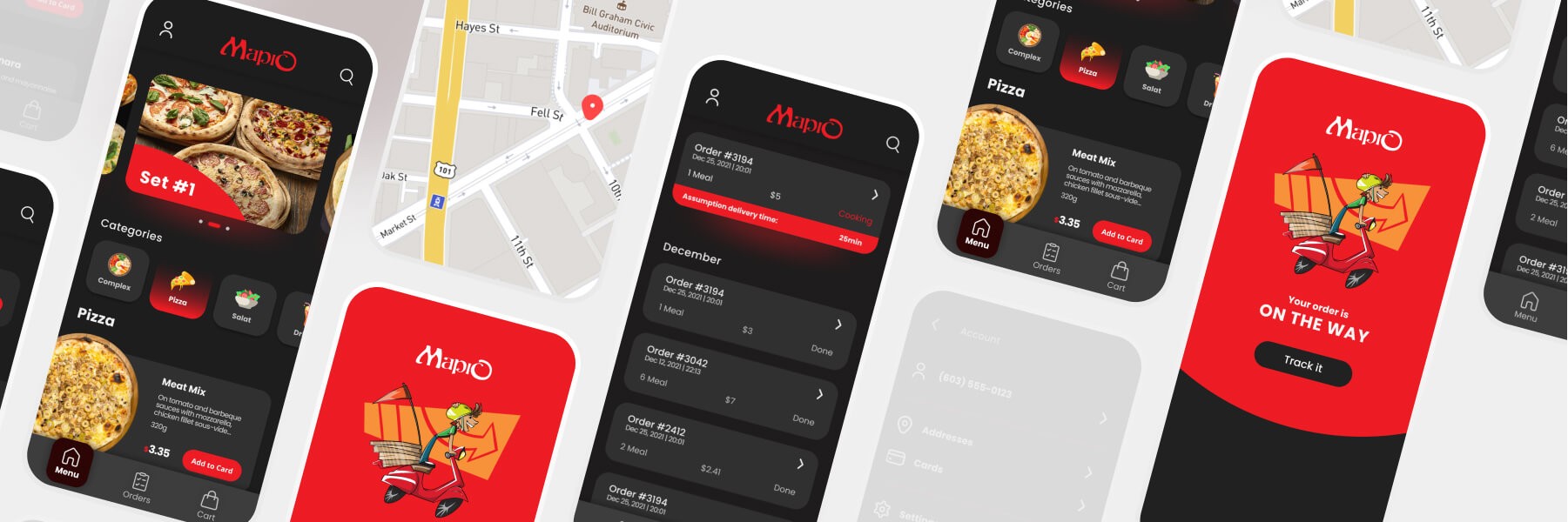
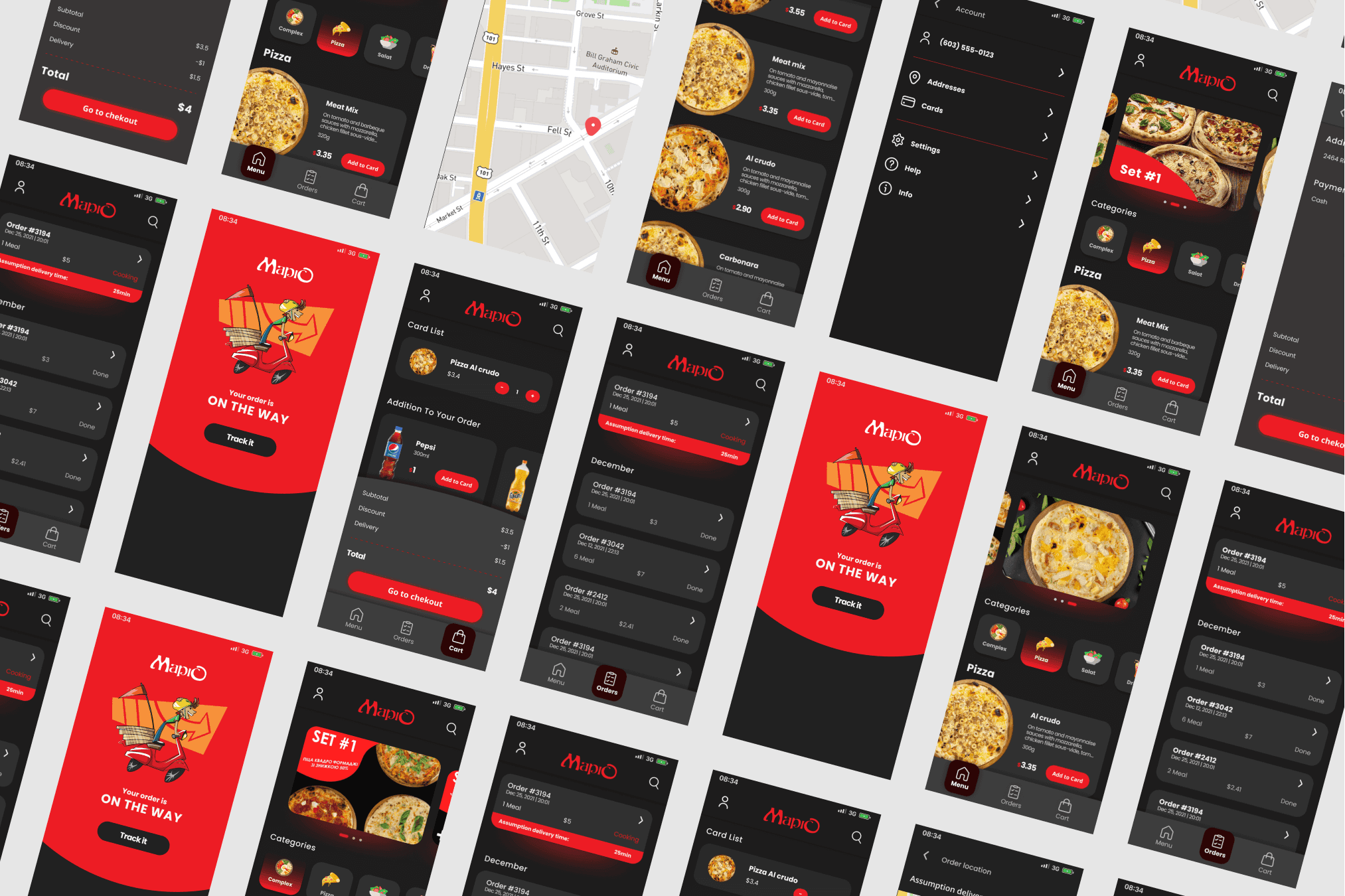
High-fidelity prototype
The high-fidelity prototype followed the same user flow as the low-fidelity prototype and included design changes made after the usability study. It was designed to be accessible to users with assistive technology needs.

Screenshot of a hi-fi prototype from Figma
Mockups
Based on the findings of the usability study, I made changes to the app's design, including simplifying the information architecture and reducing the number of features on one page. I also created consistent user flow from the "orders" page.
Before–after comparison
Accessibility considerations
To make the app more accessible, I used high contrast and visual hierarchy to create an easy-to-perceive interface, used vibrant pictures of meals for product cards, and ensured the app was compatible with assistive technology.

Permanent, temporary and situational barriers
Takeaways
Designing a user-friendly app that meets the needs of users requires user research and usability studies, as well as consideration of accessibility. Iterating designs based on user feedback can create positive relationships with customers and set the app apart from competitors.