Mar 2023
Icons Redesign
About project
Snapseed is a popular photo editing app developed by Google for both Android and iOS devices. It provides users with a range of powerful editing tools and features, including filters, adjustment tools, cropping, rotating options, and advanced retouching tools like healing and selective adjustments
Snapseed's problematic
To improve the user experience and prevent users from leaving the app due to inconsistent icons on the tools screen, Snapseed's design team should focus on adopting Material's consistent design patterns and guidelines for iconography.
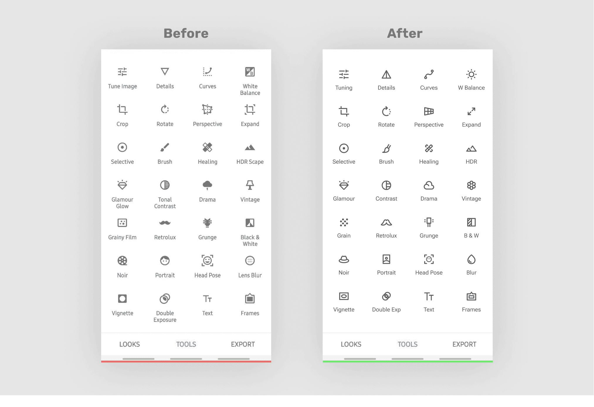
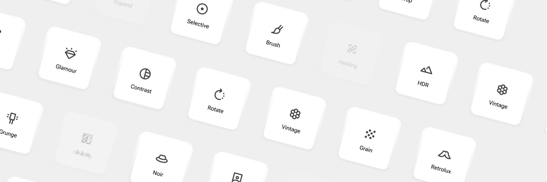
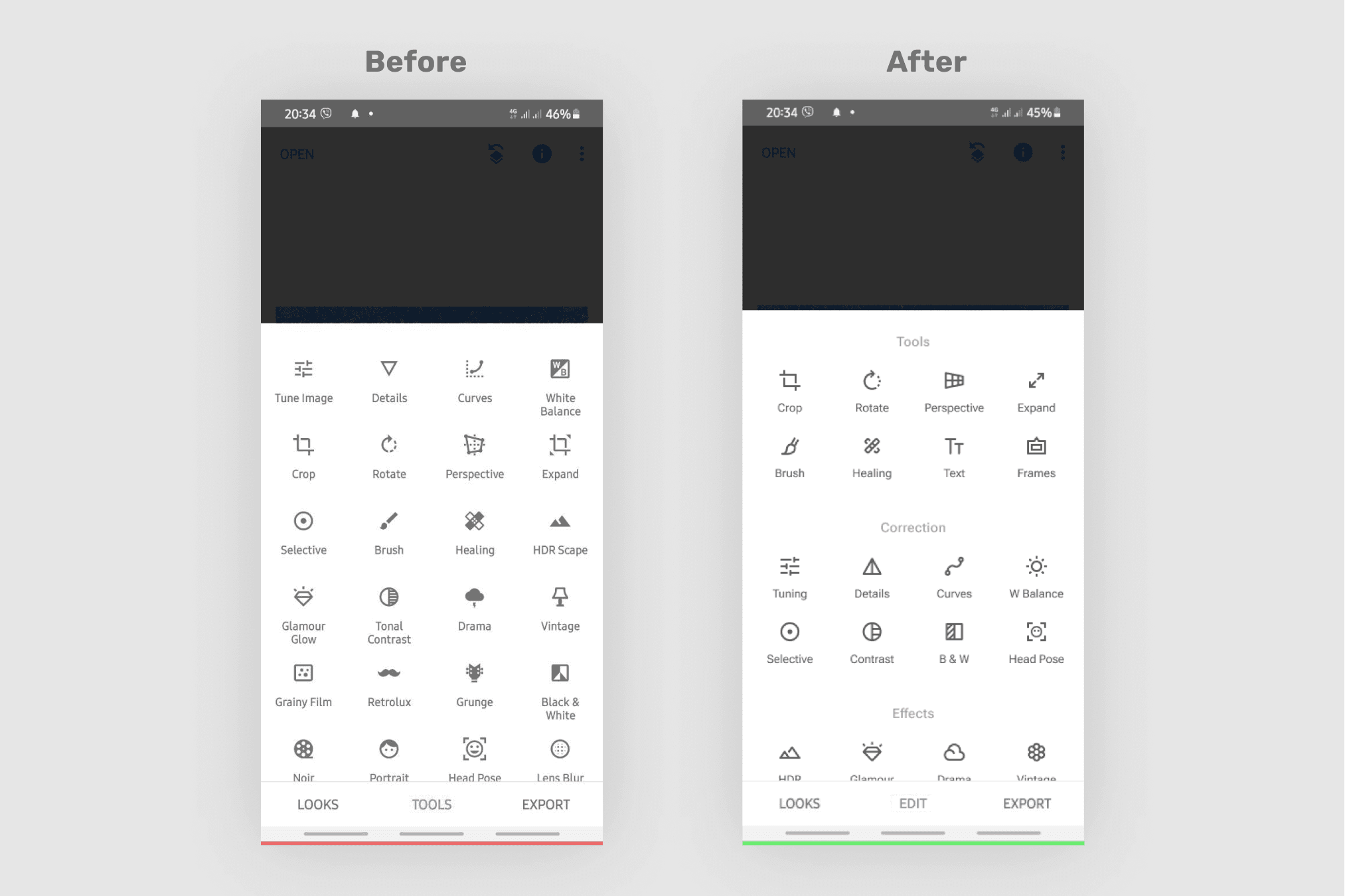
Before–after comparison
Why is inconsistency in icons harmful?
1
Creates a lack of coherence and visual hierarchy
2
Adds cognitive load and worsens performance
3
Users may not be able to recognize icons easily
Best practises
Google's design system, Material Design, provided a valuable resource for achieving a consistent look and feel across all of the products and services. Material Design's principles are rooted in creating a visually appealing and functional design language that aligns with current user expectations.
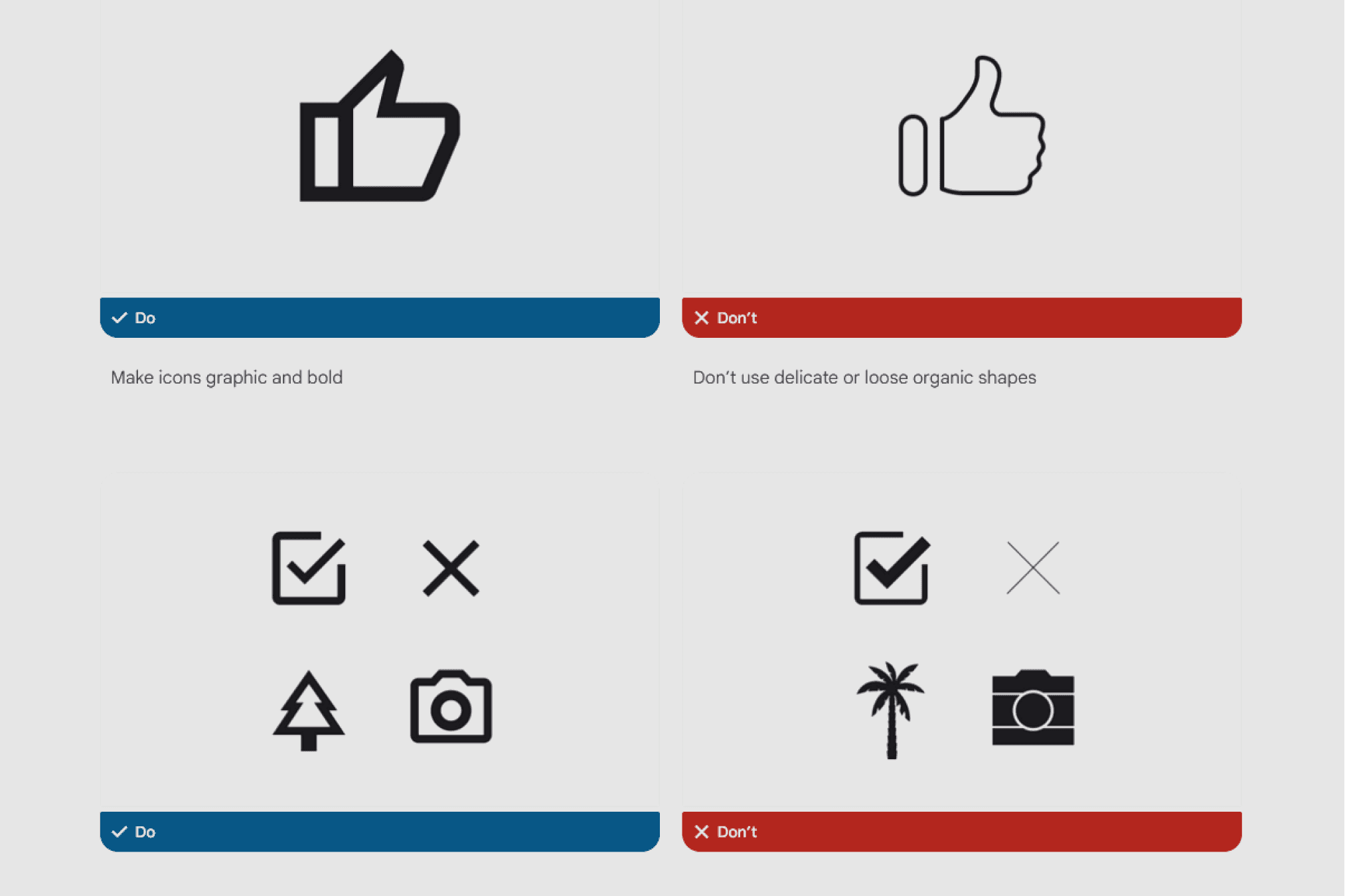
Some of the icons design principles
Competitors analysis
I examined several competitors, including VSCO, Adobe Lightroom, Picsart, and InShot, in order to identify their visual brand and unique advantages. These brands utilize a contemporary interface design and intricate iconography to appeal to younger demographics.
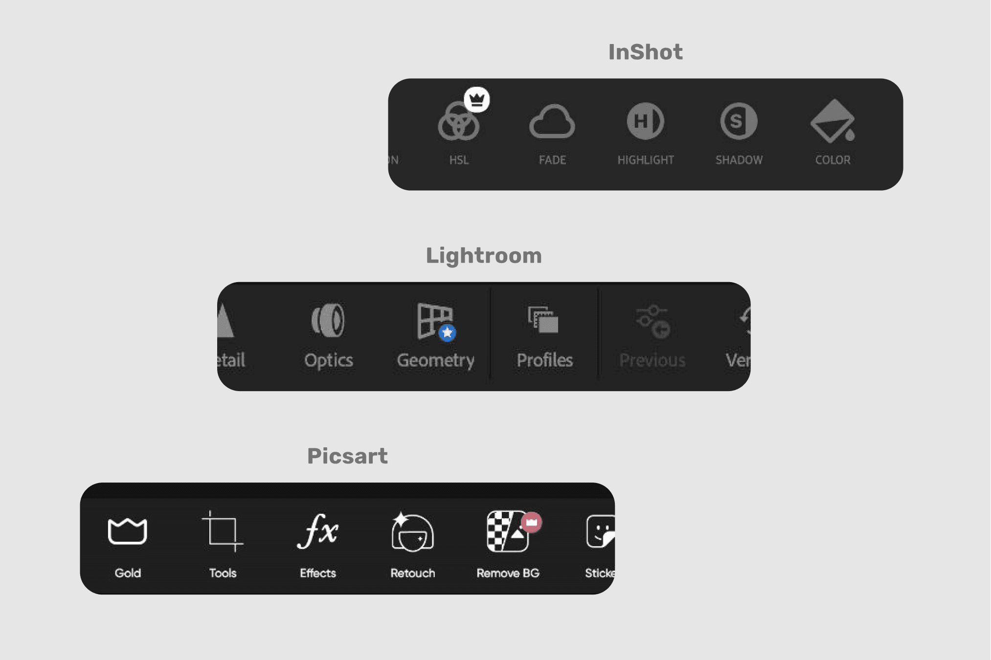
Competitors iconography
Discovering users
Although Snapseed is marketed towards photography enthusiasts who value attention to detail and desire to produce impressive images, its user base is actually quite diverse, ranging from young to old.
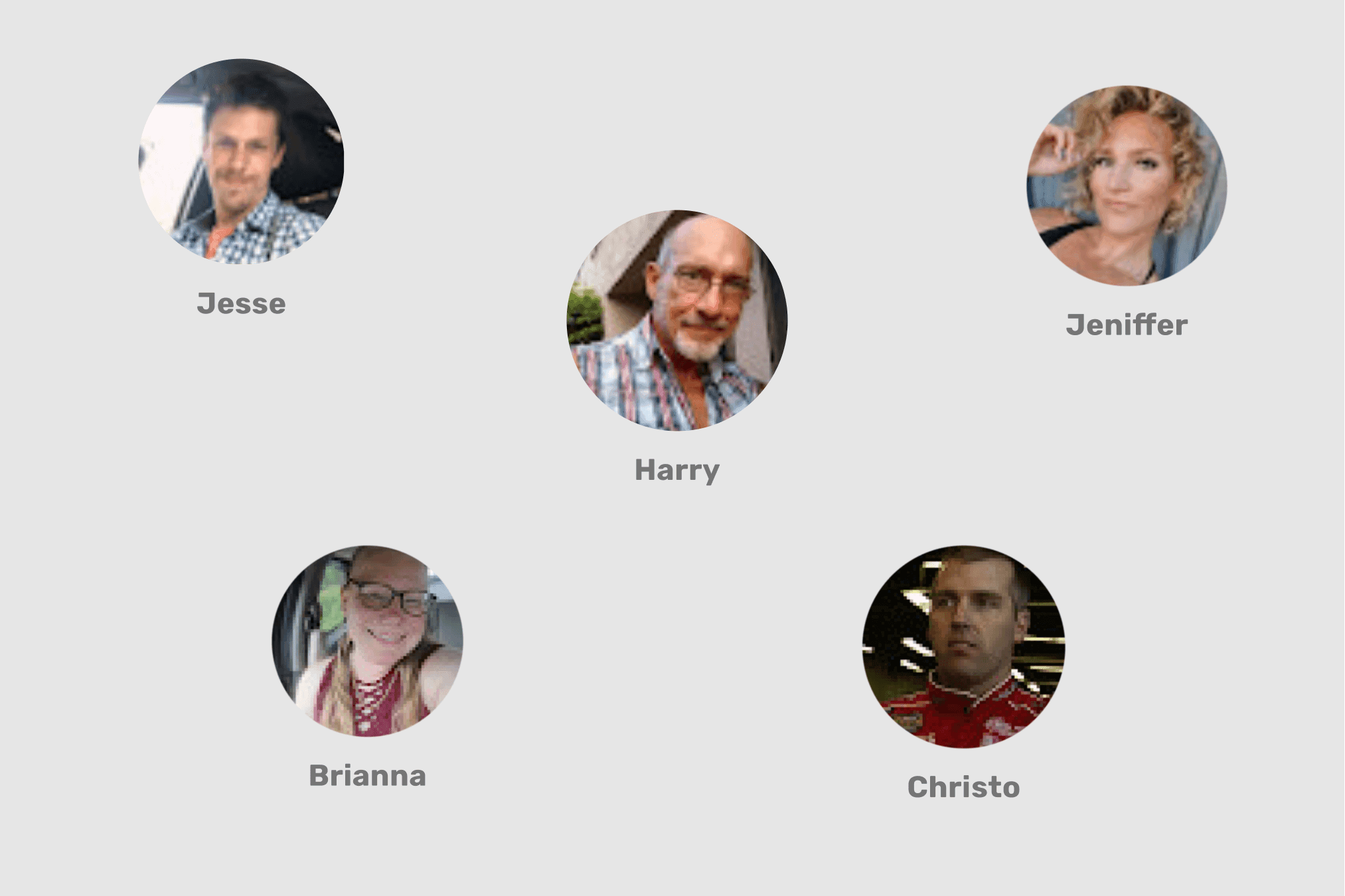
Snapseed users from Play Market reviews
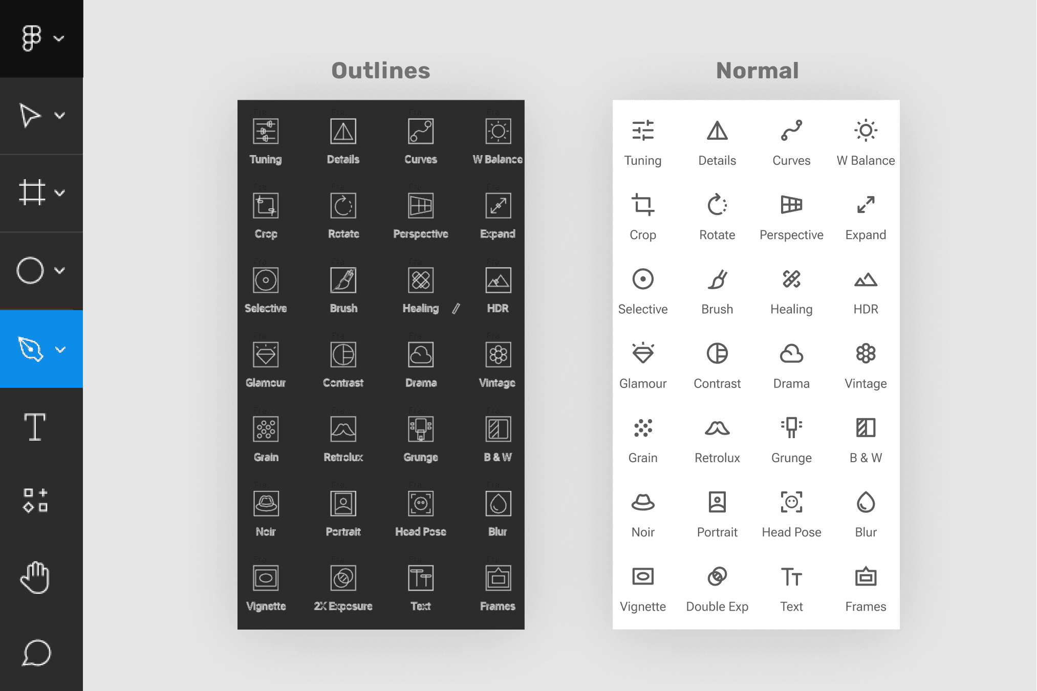
Main criterias
It's important to make icons that everyone can understand. So, I used an outline style with less visual information and added active negative space to make them look different from each other. I simplified the icons while keeping them recognizable and maintaining the visual balance.
Tool
I used Figma because it is an excellent tool for creating simple icons. Its user-friendly interface and features like "Pen" make it a great choice for digital graphic.
Figma screenshot
Pro Tip
Figma has less tools then Adobe Illustrator but great user experience of Figma creates very elastic framework. Here is how to replace Rotate tool from AI in Figma.
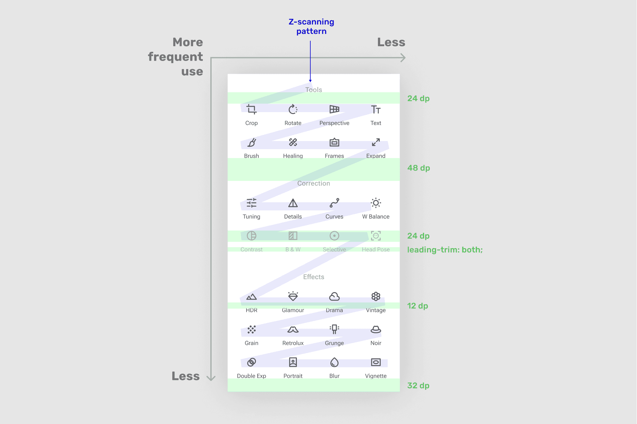
Scanning refinement
I grouped similar features on the tool screen to improve its information architecture, based on Hick's and Miller's laws. By doing so, we can improve the overall usability of the tool and make it easier for users to navigate
Before–after comparison
I added labels to the groups and center-align them for better balance. In this case it maintains a great scanning.
Design desigions
Handoff
I've prepared icons for export by outlining strokes and flattening the selection. Additionally, I have created a backup for future edits and included a link to the Material Design guidelines for designers and developers.
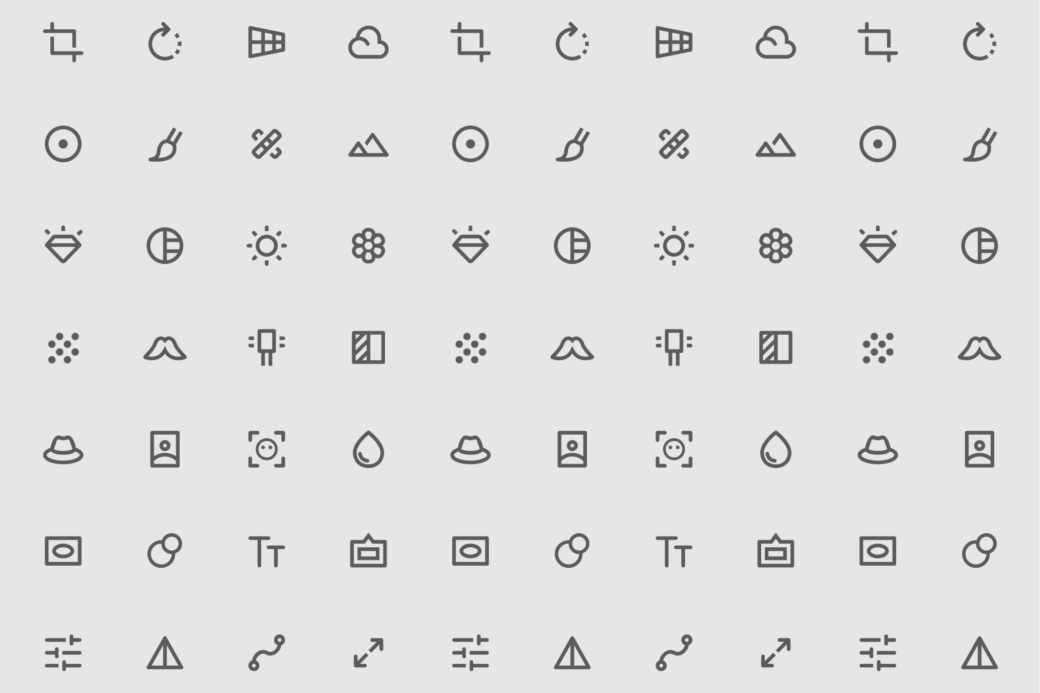
Icons set
There are no too much
A coherent icon set has been created, but it is necessary to conduct testing before implementation because the app has been in use for a while and is currently in the retention phase of the product life cycle. Therefore, it is important to ensure that the new symbols will not have any negative impact on the app's usability.
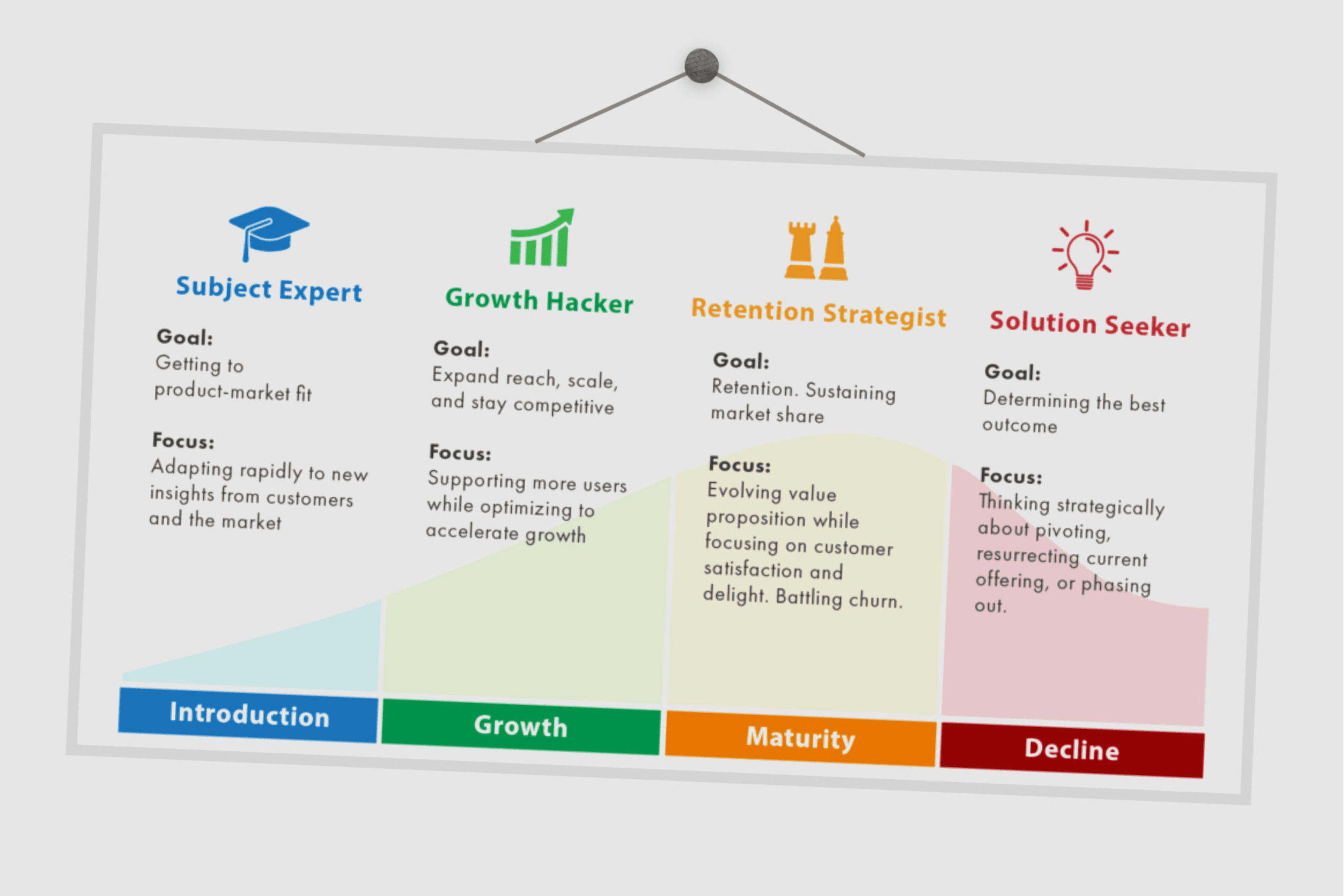
Product lifecycle diagram
Therefore, it is important to test if the new symbols won't have any negative impact on the app's usability before implementation.