Sep - Dec 2022
Domivka
Team
Vadym, Chrystyna, Alina, Anastasiia
Role
I took a part in every step of the development
Timeline
4 months
About project
Domivka Vratovanyh Tvaryn is the biggest shelter in Lviv for wild and domestic animals. After the start of the war they’ve sheltered huge amounts of animals. And that’s why the shelter need extra money to feed them.
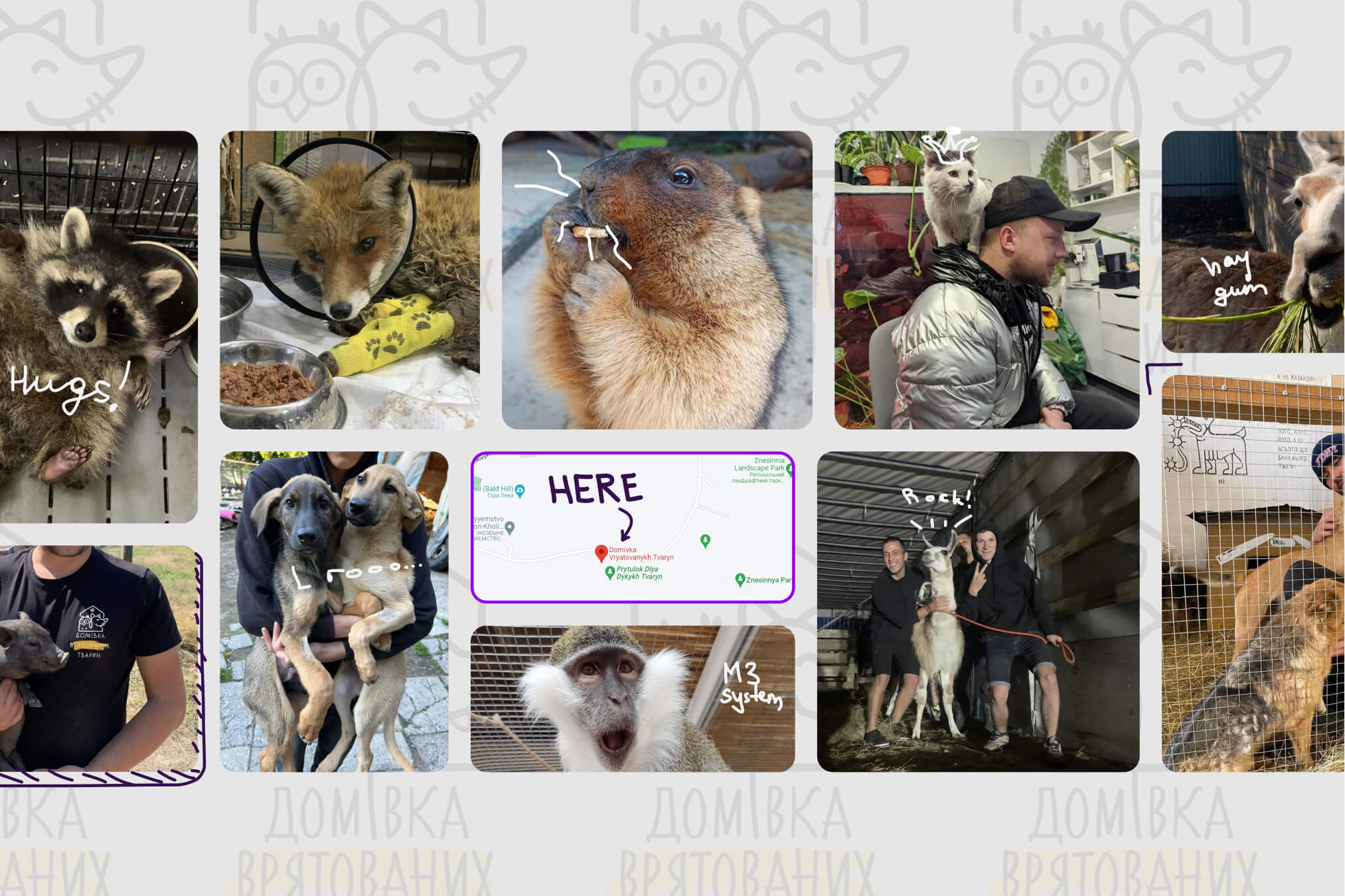
Photos from the shelter
Problem
The shelter doesn't have sufficient resources to communicate and encourage donations, and people aware of the animals' needs and don't have enough motivation to help.
Solution
Our team designed a dedicated mobile application that creates an entertaining and immersive way to provide help for the shelter and be aware of the animals life there.
Process
During the project, we followed he stages of the Design Thinking, and used Trello to visualize our work.

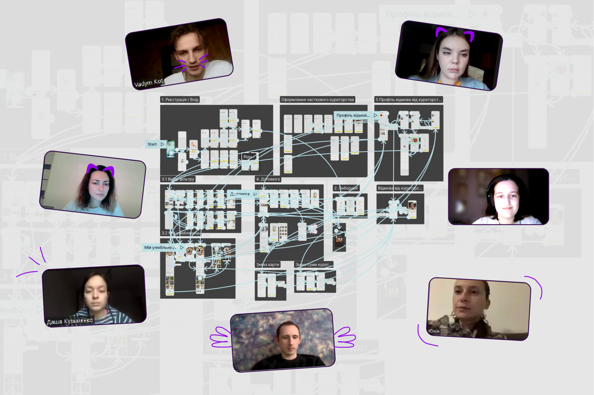
Project road map
Kick-off
Our project began with a kick-off meeting. Thanks to this meeting, we received key information and learned more about the idea and purpose of the project.
Based on the data obtained, we developed a design brief with a defined Problem Statement, Protopersonas and Lean Canvas.

Kick-off screenshot
Competitors analysis
The next step was the analysis of eight Ukrainian and four foreign animal shelters.
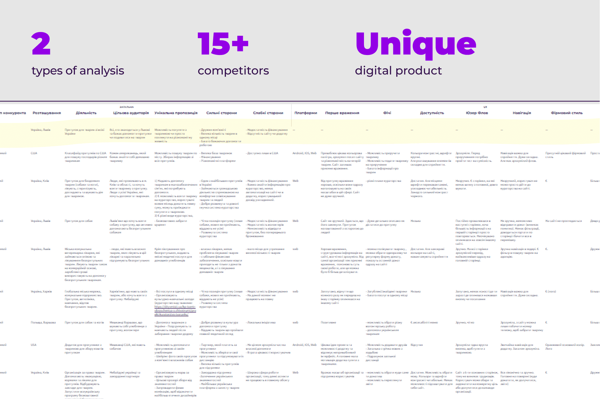
The analysis result in Google Sheets
Key insights
• The main feature of the shelter is its inhabitants. It is the only shelter that not only has dogs and cats, but also wild animals: foxes, wild boars, monkeys and many others.
• Many shelters offer animal adoptions. At the Domivka, however, curation is important, as wild and domestic animals cannot be taken in as pets.
Research
We prepared a Ukrainian and English-language surveys, which received 133 responses. Almost simultaneously with the survey, we held interview sessions with potential users of the future app.
From the interviews, we gained insights and interesting thoughts. These are summarised in the affinity diagram.
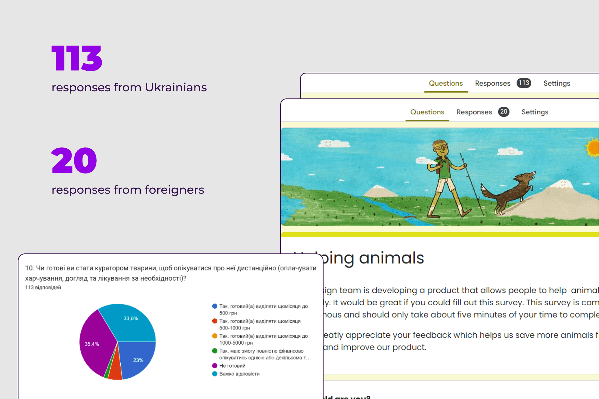
Surveys results
Defining users
We refined three personas based on the results of quantitative and qualitative research. This allowed us to design the app for real users, based on what they wanted and needed.
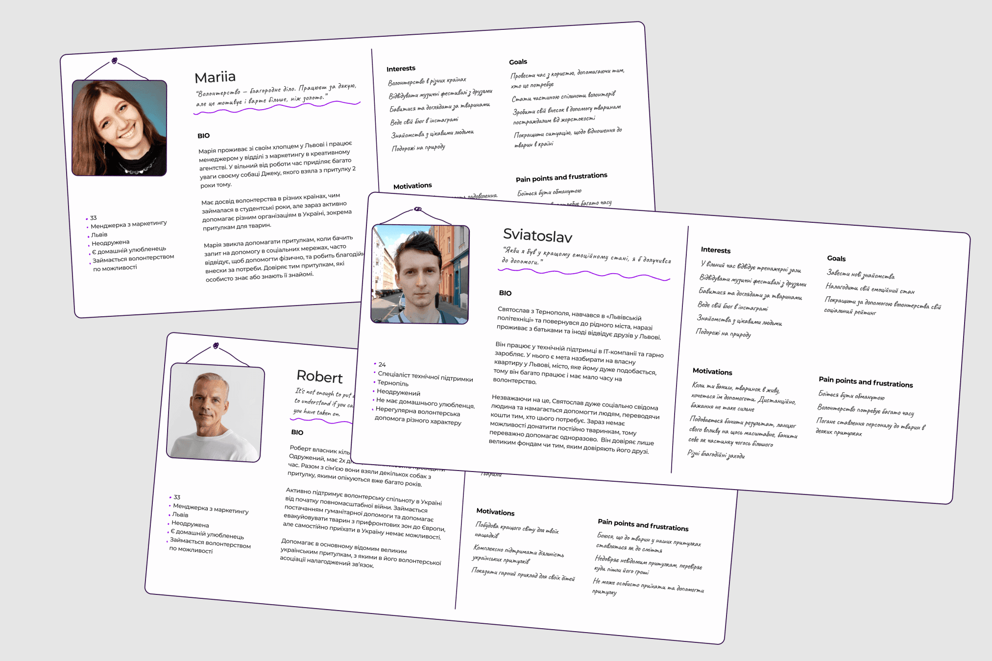
Defined user personas
CJM workshop
Next, we conducted a CJM workshop. It was set up to identify visitor pain points and opportunities for improving their experience.
We invited three potential users and stakeholders.
We then prioritised ideas using the Impact Effort Matrix, wrote out problems and solutions, and developed an action plan based on potential users' needs.

Screenshot from the CJM workshop
Ideation
We liked the way the ideas came out of the CJM workshop, so we decided to hold two more: Storyboard and Walt Disney Rooms, to find original user problem-solving ideas.

Resuls of the storyboard workshop
We prioritized all the ideas with Dot Voting and determined MVP features for the app.
Information architecture
Since Domivka was about to release a website, we decided to focus users' attention on the most important thing - curation. We started with a Mind map, after that we developed a Site map of the application, which was later changed and updated several times to get the best result.

Uers flows of the app
Key insights
• A profile screen where you can check out your achievements. We found out that achievements will encourage donation and
interest of users to the app.
• A help screen where you can send a charitable donation and learn more about the events in the shelter.
• A main screen where you can find an animal and become its curator.
The main User Flow has become a subscription to the curation.
Wireframes
We started working on Wireframes with the Crazy Eights workshop, it helped to define the layout of the main screen. And we proceeded designing remaining screens.
We decided to use patterns and UI kit Material when creating wireframes, because, according to Statecounter, 77% of Ukrainians are Android users.
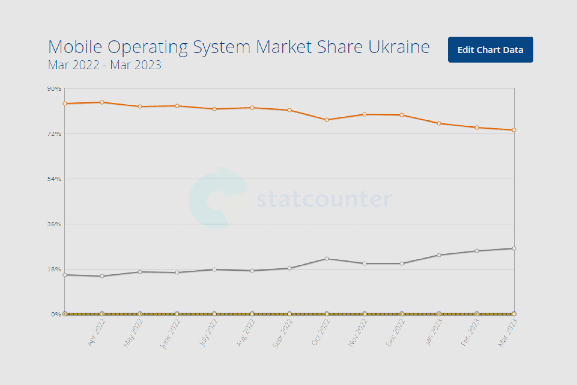
A statecounte.com chart
Testing
The primary purpose of the test was to verify the usability of the app. It was essential to see if users understand the curation process and if they face any problems at this stage.
Besides, one of our tasks involved finding out if the registration procedure in the application is comfortable for users.

Screens for the first usabiloty test
Key insights
• The users didn't notice the filters due to an icon that they didn't understand. So we changed the icon and the visability of the filter.
• Users were mistakenly using the switcher in the filter. Therefore, we changed its location.
• The users expect to find a curation disclaimer in the profile, as it corresponds to their previous experience.
After testing, we generated a report and an action plan.

The report and the action plan of the usability test
Delivery
Our work was organized on the principle of the atomic design, so we created a set of components and options that were easy to edit, which greatly simplified and accelerated the work on the project.
Domivka has its own brand color - yellow, that's what made it the main color of the app. As for typography, we chose the Mulish typeface family as it is open, friendly, and readable.
Considering all the feedback we got from our potential users during the testing, we began work on the visual part of the project.
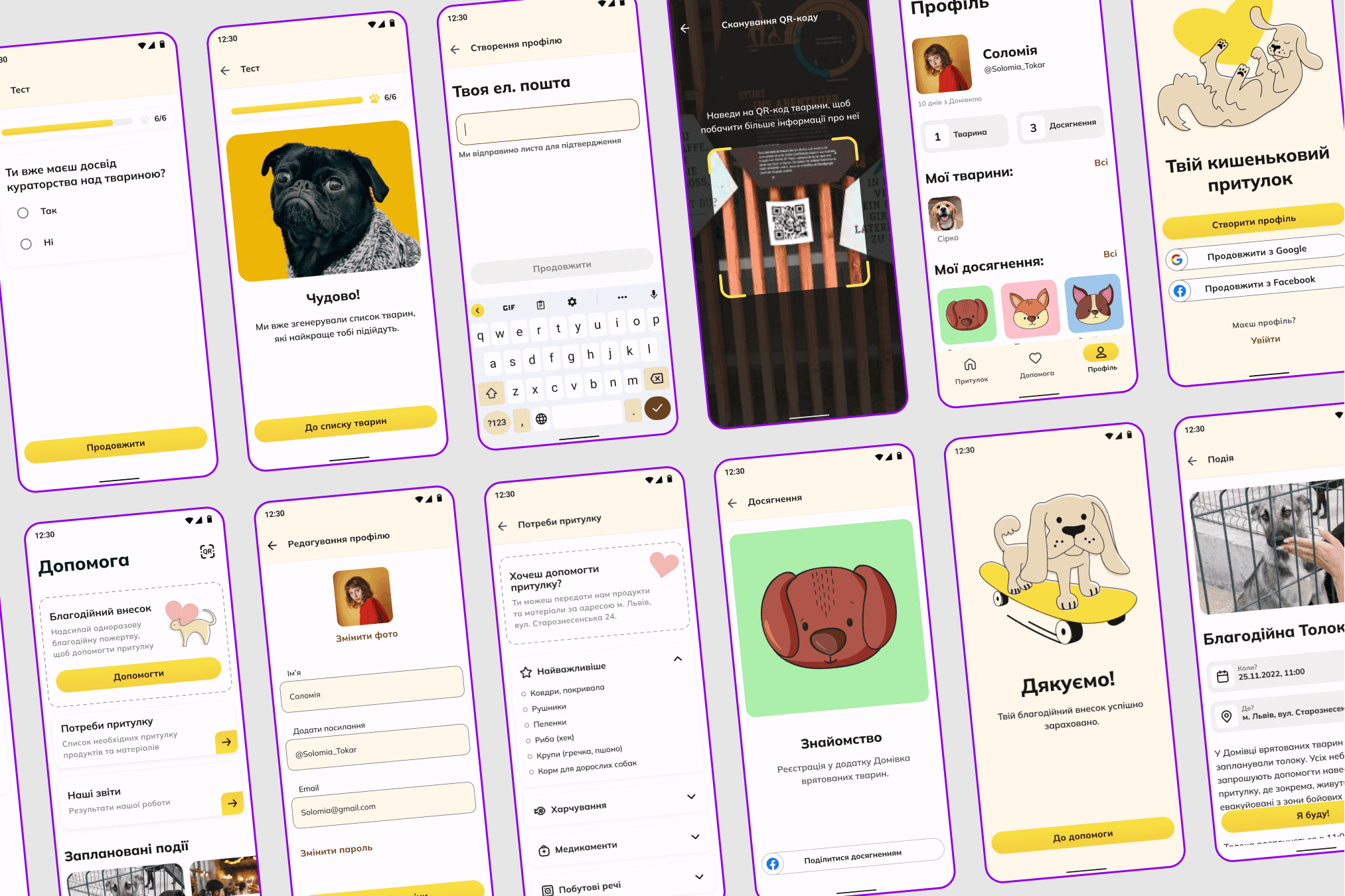
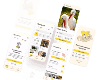
Some of the screens of the app
Usability testing 2.0
We received good feedback and a couple of comments as a result of the test, and based on them, we made the following changes:
• We added hints describing the difference between full and partial curation
• Reduced the number of achievements and regrouped them
• Refined the description of payment terms.
Screenshots from the testing sessions
Landing Page
It was discovered that many users interact with the shelter social media through a computer, so we created a Landing Page, where we explained in detail how the app works, what its features are, and why it is worth helping animals through the mobile application.

The landing page
Presentation
We presented our work at the EPAM conference.
Was responsible for presentation visual
Our stakeholders were very pleased with the whole process and the final result. We're staying in touch as the application is implementing already.

Feedback of our stakeholders from social medias
Finally
“Think of giving not as a duty, but as a privilege"
Charity is generally a selfless activity, but we tried to create a mobile application that allows not only to contribute to the needs of the shelter, but also to have fun, feel the importance of each donation and become part of a big and meaningful community.